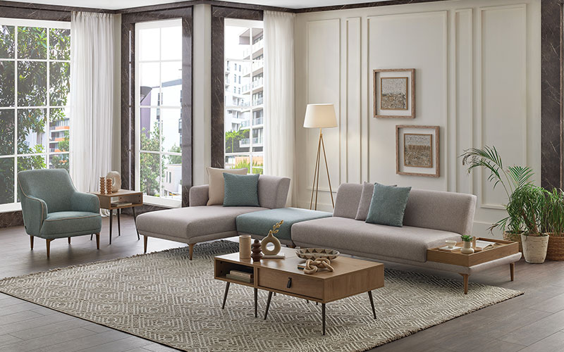
Creating a harmonious home starts with the right color palette. Colors influence mood, perception of space, and even how connected a home feels. When thoughtfully combined, they bring balance, comfort, and personality into every room. Below are practical and timeless color palette ideas that help you design interiors that feel cohesive rather than chaotic.
Understanding Harmony in Home Colors
Color harmony is about visual balance. It doesn’t mean using one color everywhere—it means selecting shades that naturally work together.
Key principles of harmonious color design include:
- Consistency across spaces without making rooms feel repetitive
- Balanced contrast to avoid dullness or visual overload
- Purpose-driven colors based on room function and lighting
A harmonious palette often blends a dominant color, a secondary support shade, and a subtle accent.
Neutral Color Palettes for Timeless Balance
Neutral palettes are the backbone of many harmonious homes. They create a calm foundation and adapt easily to changing décor trends.
Popular neutral combinations include:
- Warm beige + soft white + muted taupe
- Light gray + ivory + charcoal accents
- Greige (gray-beige) + cream + natural wood tones
Neutrals are especially effective in open-plan homes, helping multiple rooms flow together seamlessly.
Warm Color Palettes for Cozy Living Spaces
Warm colors make spaces feel inviting and grounded. They work beautifully in areas meant for relaxation and socializing.
Effective warm palette ideas:
- Terracotta + sand + soft clay
- Muted mustard + warm white + walnut brown
- Soft blush + cream + copper accents
These palettes enhance comfort, especially in living rooms, dining spaces, and bedrooms.
Cool Color Palettes for Calm and Clarity
Cool colors bring a sense of freshness and tranquility. They’re ideal for spaces where focus and calm matter most.
Balanced cool combinations include:
- Soft blue + pale gray + crisp white
- Sage green + off-white + light oak
- Muted teal + stone gray + brushed metal accents
Cool palettes are excellent for home offices, bathrooms, and minimalist interiors.
Earth-Inspired Palettes for Natural Harmony
Earth tones connect interiors with the outdoors, promoting warmth and stability without overwhelming the senses.
Common earth-tone mixes:
- Olive green + clay brown + linen white
- Stone gray + sand + weathered wood
- Rust + muted green + soft beige
These palettes shine in homes that emphasize natural materials, plants, and organic textures.
Using Accent Colors Without Disrupting Balance
Accent colors add personality, but restraint is key to maintaining harmony.
Best practices for accents:
- Use accents in small doses (pillows, art, rugs)
- Choose shades already present in adjacent rooms
- Keep accents slightly muted, not overly saturated
Popular accent choices include navy, forest green, burnt orange, and deep plum.
Creating Flow Between Rooms
A harmonious home feels connected, even when rooms serve different purposes.
To maintain flow:
- Repeat one core color throughout the home
- Shift shade intensity, not hue, between rooms
- Use similar undertones (warm or cool) across palettes
This approach allows variety while preserving unity.
FAQs
What is the best color palette for a small home?
Light neutrals paired with soft accents work best, as they reflect light and make spaces feel larger and more open.
How many colors should a harmonious palette include?
Most balanced palettes use three to five colors, including neutrals and accents.
Can warm and cool colors be mixed in one home?
Yes, as long as there is a unifying neutral or consistent undertone to tie them together.
How do I choose colors based on natural light?
Rooms with limited sunlight benefit from warmer tones, while bright rooms can handle cooler shades comfortably.
Are bold colors bad for harmonious interiors?
Not at all. Bold colors work well when used intentionally and balanced with calmer supporting tones.
Should ceilings and walls always match?
No. Slightly lighter ceilings often enhance height and openness without breaking harmony.
How often should a home color palette be updated?
A strong base palette can last for years. Updating accents every season keeps the space feeling fresh without repainting.


