Color is more than decoration—it quietly shapes how a space feels, functions, and is remembered. In interior design, color psychology explores how hues influence mood, perception, and behavior. When chosen intentionally, colors can make rooms feel larger or cozier, calmer or more energetic, and even affect how people interact within a space.
This guide breaks down how color psychology works in interiors and how to use it effectively, without guesswork or trends that fade fast.
What Is Color Psychology in Interior Design?
Color psychology studies the emotional and mental responses people have to different colors. In interiors, it helps designers and homeowners:
-
Set the emotional tone of a room
-
Support the room’s purpose (rest, focus, socializing)
-
Influence perceived space, light, and temperature
-
Create visual harmony and balance
While personal preference and culture matter, many color responses are surprisingly consistent across people.
Warm Colors and Their Effects
Warm colors tend to energize spaces and draw people in. They visually advance, making rooms feel more intimate.
Red
Red is bold, stimulating, and attention-grabbing. It increases heart rate and appetite, which is why it’s often used in dining areas.
Best used for:
-
Dining rooms
-
Accent walls
-
Social spaces
Use sparingly—too much red can feel overwhelming.
Orange
Orange combines the energy of red with the friendliness of yellow. It encourages conversation and creativity.
Best used for:
-
Playrooms
-
Creative studios
-
Casual living areas
Muted or earthy oranges are easier to live with long-term.
Yellow
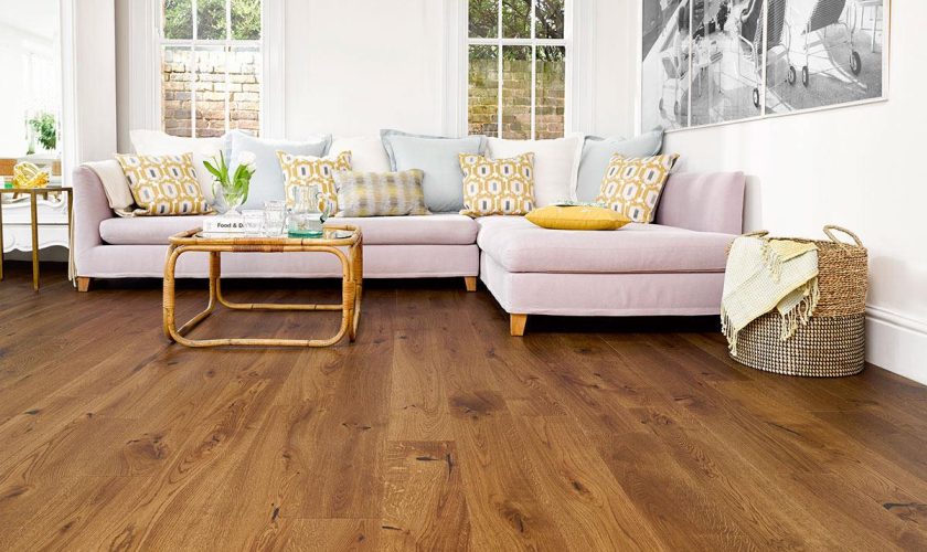
Yellow is associated with optimism and light. It can make darker rooms feel brighter and more welcoming.
Best used for:
-
Kitchens
-
Breakfast nooks
-
Entryways
Soft or warm yellows work better than harsh, neon tones.
Cool Colors and Their Effects
Cool colors are calming and visually recede, making spaces feel more open and restful.
Blue
Blue promotes calm, focus, and clarity. It’s one of the most versatile colors in interior design.
Best used for:
-
Bedrooms
-
Bathrooms
-
Home offices
Darker blues add sophistication, while lighter shades feel airy.
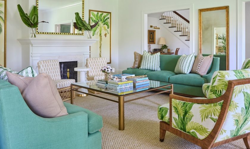
Green
Green represents balance and nature. It’s easy on the eyes and works well in almost any room.
Best used for:
-
Living rooms
-
Bedrooms
-
Reading spaces
Earthy greens create comfort; cooler greens feel fresh and modern.
Purple
Purple is associated with creativity and luxury. Its effect depends heavily on the shade.
Best used for:
-
Accent areas
-
Creative spaces
-
Statement rooms
Soft lavenders feel calming; deep purples feel dramatic and rich.
Neutral Colors: The Emotional Anchors
Neutrals don’t mean boring. They provide balance and let other elements shine.
White
White suggests cleanliness and simplicity. It reflects light and makes rooms feel larger.
Use with texture and contrast to avoid a sterile look.
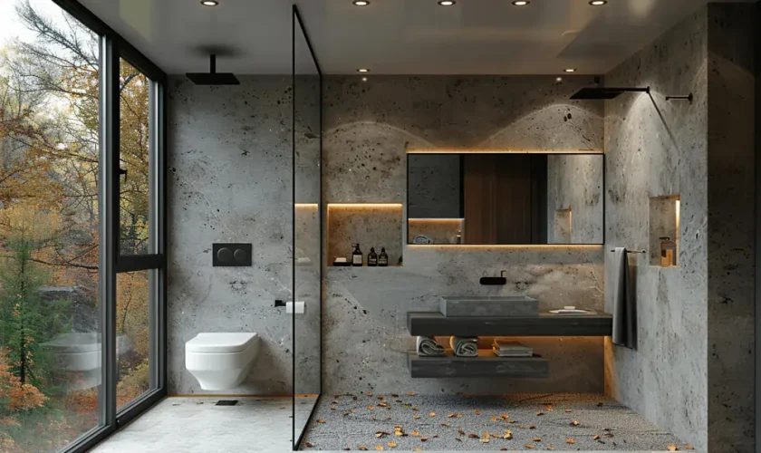
Gray
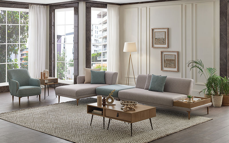
Gray is modern and calming but can feel cold if overused.
Pair with:
-
Warm wood tones
-
Soft textiles
-
Accent colors
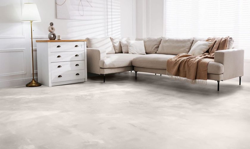
Beige and Taupe
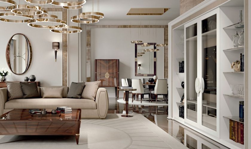
These warm neutrals create comfort and timelessness.
Ideal for:
-
Living rooms
-
Bedrooms
-
Open-plan spaces
How Color Affects Space and Light
Color changes how we perceive room dimensions and brightness:
-
Light colors make small rooms feel larger
-
Dark colors add depth and coziness
-
Cool tones visually expand walls
-
Warm tones make spaces feel more intimate
Natural and artificial lighting will always influence how a color appears, so testing samples in the actual space is essential.
Choosing the Right Color for Each Room
A practical approach is to match color mood with room function:
-
Bedrooms: blues, greens, soft neutrals
-
Living rooms: warm neutrals, muted greens, soft blues
-
Kitchens: whites, yellows, warm grays
-
Bathrooms: blues, whites, light greens
-
Home offices: blues, greens, neutral backdrops
Accent colors can add personality without overpowering the room.
Common Mistakes to Avoid
-
Choosing colors without testing them in real lighting
-
Overusing bold colors on all walls
-
Ignoring undertones in neutrals
-
Following trends instead of function
-
Forgetting how adjacent rooms interact
Color works best when it supports both emotion and practicality.
FAQs
How does color psychology influence mood in a home?
Colors subtly affect emotions such as calmness, energy, and comfort, shaping how people feel and behave in a space.
Are color psychology effects the same for everyone?
While general responses are common, personal experiences, culture, and preferences can influence how colors are perceived.
Can dark colors work in small rooms?
Yes, when used strategically. Dark colors can add depth and sophistication, especially with good lighting and contrast.
How many colors should be used in one room?
A balanced approach is best—typically one main color, one secondary color, and one accent.
Do neutral colors have psychological effects?
Yes. Neutrals can create calm, stability, and openness, depending on their warmth and undertones.
How do I test a color before committing?
Apply sample patches on multiple walls and observe them at different times of day under natural and artificial light.
Should color choices follow trends or personal taste?
Personal comfort should always come first. Trends can inspire, but timeless colors aligned with function age better.